Little Lives First Aid
Branding
A company specialising in paediatrics first aid were looking for branding. During our initial meeting Francesca expressed a likeness of how male penguins look after the chick, in addition to heart shapes and the colour blue.
An objective was to get across caring, and nurturing elements in the logo. The courses would have relaxed atmosphere and reflecting this was important. Two ideas were generated.
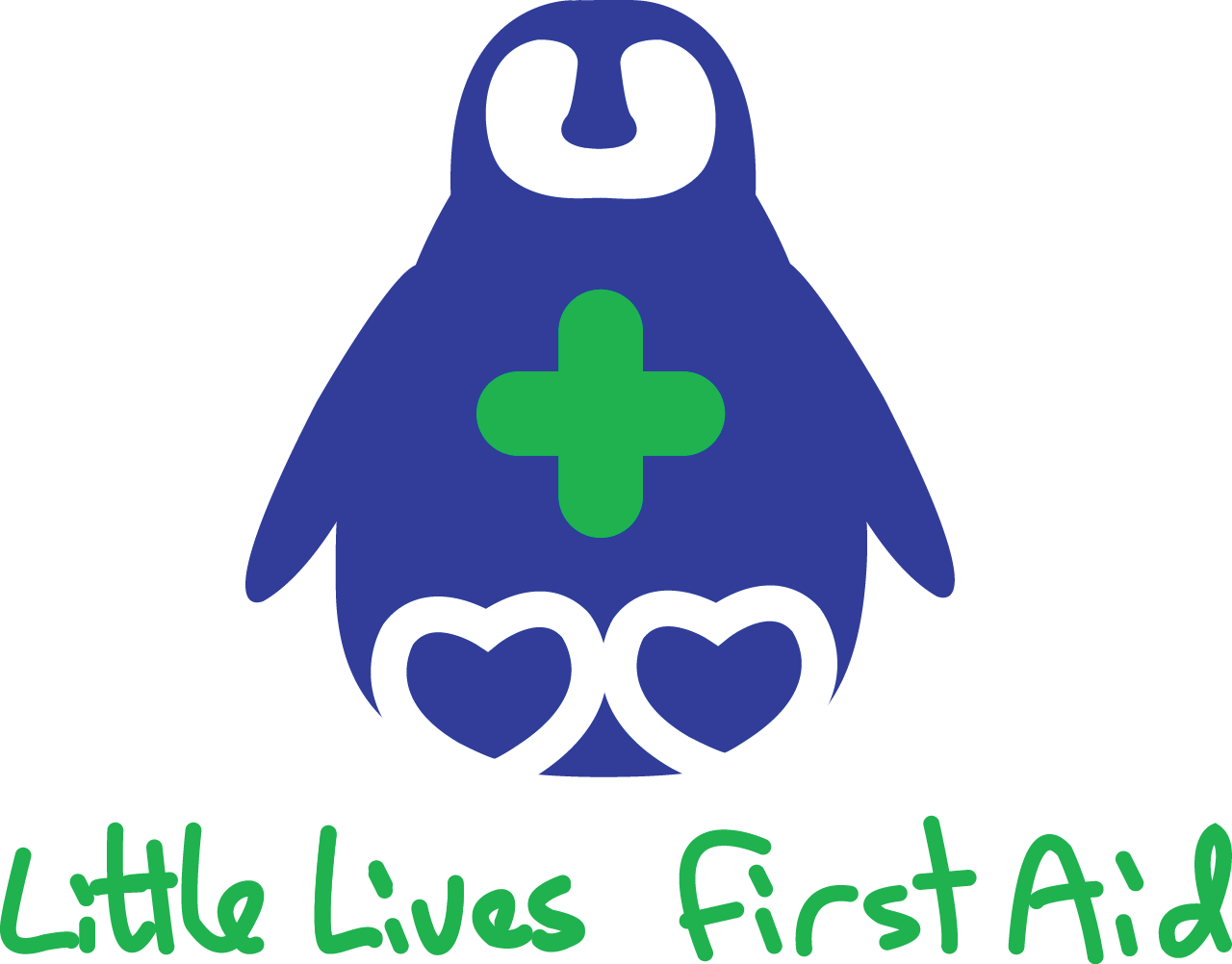
Inspiration for the second option came from the penguin chick idea and incorporated two plasters forming a cross for the first aid element.
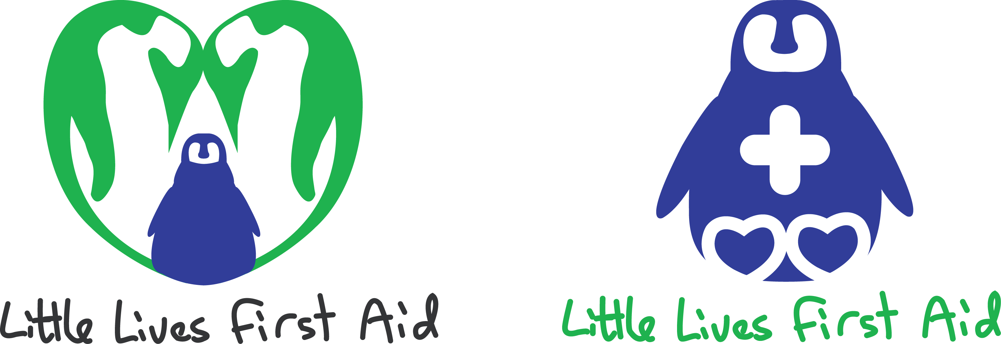
The second logo was the preferred option, with a few modifications.
Design for Print
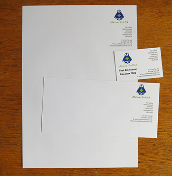
A stationery set was designed for Little Lives First Aid.
Packaging
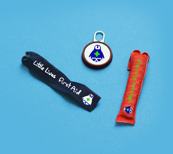
A future ambition of Little Lives First Aid is to sell first aid kits at the training. Suitable packaging solutions were explored and branded zip pulls were preferred.
Testimonial
'I have been very impressed with her work. She is very professional, reliable and has been a pleasure to work with. I would have no hesitation in recommending Julie'
Francesca Philp- Little Lives First Aid
back to top